
If you’ve been reading EV Mag for any significant length of time, chances are you’re familiar with my belief that the most critical ingredient for consistently creating captivating images is the creative vision. And the way I like to define creative vision is your ability to see the extraordinary in the ordinary.
Problem is, as palatable as it may sound, this definition is somewhat vague and offers little in the way of practical application. Which raises the question, “How can we refine our ability to see the extraordinary in the ordinary in a practical manner?”
While the three-step formula detailed in my free ebook, The Ultimate Photo Tip is arguably the most powerful formula for predictably elevating the emotional power of your photography, many readers have asked me for even more pragmatic ways to express their unique artistic voices.
Having given considerable thought as to how I can address these requests, it dawned on me that the one aspect of creative photography most influenced by creative vision is composition. That’s because how we frame a scene and how we determine what to include or exclude are intimately linked to our creativity and our unique perspectives.
With that in mind, I’ve decided to create a series of articles that aim to break down the key components of the composition in such a way that you can easily and instantly apply them to your photography.
So in this the first article of the series, I want to discuss one of my favorite compositional tools – negative space.
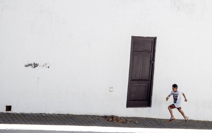
Photo By: Georgie Pauwels
Now in case, you’re not familiar with the term, negative space is commonly used to refer to the space within a frame that surrounds the main subject of interest, the latter of which is often called the positive space.
To help demonstrate this principle, take a look at the following famous figure. If, when you look at this image you see two faces, the white areas constitute the positive space while the black constitutes the negative space. Alternatively, if you see a vase, then the black is the positive space while the white constitutes the negative space.
Illustration Of Negative Versus Positive Space

From this, we can reasonably conclude that negative space encompasses everything in your composition that is not your primary focus of interest.
Seems simple enough.
But as you’re about to see, negative space is arguably the single most important compositional aspect that helps your image’s primary element of interest stand out and captivate the viewer’s attention. And while it may seem easy in principle, incorporating negative space into your images effectively can prove to be rather challenging.
Now classically, negative space is often thought of as being devoid of much or any detail. By not competing with the viewer’s eye for attention, the negative space naturally draws attention to and emphasizes the primary subject in the image. And the reason this works so well is that our brains are programmed to seek out points of difference. Put a full stop amongst scribes of text and you will pay it no attention. Place that same full stop on a blank page and your eye will be automatically drawn to and fixated upon the tiny dot.
Unfortunately, over time and through over-simplification, negative space has become synonymous with emptiness in an image. Ironically, this common misconception has only made it more difficult for many photographers to effectively use negative space to make their images more dramatic.
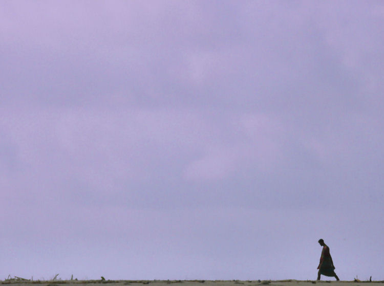
Photo By: Joiseyshowaa
Allow me to elaborate.
While subjective by nature, good composition boils down to achieving balance. And just like a balance scale is tipped by differing weights, the balance of an image is determined by the combined “visual weights” of its component parts. In simple terms, visual weight determines where the viewer’s eye slows down or even stops. Typically, the primary subject of your image should possess the greatest visual weight.
Now to “feel right,” this weight needs to be in balance with the rest of the frame. This, of course, is the domain of negative space. The primary purpose of negative space is to counter-balance the main focal point of an image in such a way that it controls how and where the viewer’s eye moves within the frame.
However, where the term negative space gets in the way is its implication that this area is “empty” and in turn is not an active element of composition itself, merely a means to emphasize other elements.
This simply is not true. Like everything in a photograph, negative space possesses visual “weight.” As such, we need to be very careful when deciding how much “negative space” to include and where. What’s more, “adding” or “taking away” negative space will directly affect the weight of other elements in an image, as they effectively become “lighter” or “heavier” within the frame.
So what does all this mean in practical terms?
Quite simply, the term negative space is relative. While it is traditionally considered to comprise of “emptiness,” negative space can just as effectively be comprised of bold colors, patterns, textures and even other objects. So rather than using the term negative space – which implies emptiness – I much prefer to use the term “Accentuating Space.” And the reason I prefer the term “accentuating space” is that it more accurately reflects its purpose in an image, namely to accentuate the primary subject.
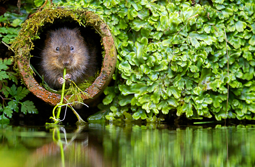
Photo By: Mark Bridger
Now you may think this alternate terminology is an exercise in pedantics. However, its power comes from its liberation of our creative minds to look for a wider variety of compositional elements beyond just plain “emptiness” that can be used to accentuate our focal subject.
So rather than seeking out only “emptiness,” with this broadened awareness, our eyes will suddenly perceive a plethora of elements to accentuate our key subject that we previously overlooked.
What I also like about the term accentuating space is that it implies that we are doing more than just drawing the eye to our focal subject. Aspects such a mood, context, simplification, intellectual provocation, harmony and even storytelling are all greatly influenced by our judicial use of accentuating space.
In this way, accentuating space can dramatically alter the mood and story of an image. In many cases, accentuating space is what creates the mood and emotion in the first place. It can also impart context in the sense it can create a sense of lightness, airiness; it can strengthen the positive emotions in a photograph; emphasize the feelings of your subject whether they are romantic or simply joyful. It can also add a sense of loneliness or despair.
In short, whatever message you are trying to convey, whichever feelings, emotions you want to evoke, whichever story you want to tell, the use of accentuating space affects them all. It can either emphasize all of these aspects or, when used injudiciously, turn everything around.
A good example of this can be illustrated in the following two versions of the identical image. In the first image (a cropped version of the next), the subject occupies almost half the entire space within the frame. As a result, although we see a great deal of detail in the woman, it’s difficult to know where to rest our eyes. Is it her smile? Her right hand? Her left hand? Or perhaps her hat?

Photo By: Fifi Lan
Now contrast that with the following image. Although we are looking at the exact same figure in the exact same pose, all of a sudden we see the woman in context with her environment. All of sudden the woman becomes a graphical element that instantly and instinctively draws our eye to her. And that’s because she now disrupts the pattern created by the surrounding fruit. In short, it’s clear where our eyes should rest (i.e. the woman). In this way, the woman is allowed to “breathe” within the frame.
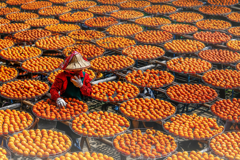
Photo By: Fifi Lan
So even though these are two images of an identical subject, they convey very different stories and evoke very different emotions… and it’s all due to the varying use of accentuating space.
Now you might be wondering, which of these is the “better” image? Which is the more powerful composition?
Naturally, when dealing with any artwork, beauty is in the eye of the beholder. There is no definitive answer. Both are beautiful and both are powerful.
What I would argue is way more important from our perspective as photographers is understanding how the use of accentuating space can be deliberately “turned up” or “turned down” to impart just the “right” amount of visual balance and harmony that resonates with the mood and feel we intend to convey.
Once again, there is no right or wrong – only what feels right to us as the composing artist. But the key to achieving this balance is being aware of the power of accentuating space and using that power with intent.
Now if you were painting a painting or drawing a picture, incorporating accentuating space in your artwork is relatively easy. You have full creative control as to what you put in and what you leave out.
However, for the photographer, creating harmony with accentuating space is considerably more challenging, particularly outside the comfort of a studio where we’re confronted with infinite combinations of light, form, weather and subject matter. Sometimes we’ll be presented with situations where accentuating elements are obvious. But more often than not, we’ll have to get creative with a subject to harmoniously incorporate accentuating space within our image.
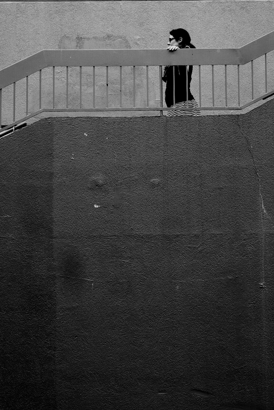
Photo By: Nymeria
So the obvious question to ask is, “How can we use accentuating space with intent? What practical tools are available to us to harness the power of accentuating space?”
Perhaps a useful place to begin is to actually define accentuating space. For me, accentuating space can be defined as the part of our composition surrounding our primary subject that serves to control the emotional impact of that primary subject. Rather than mere “emptiness,” this accentuating space can be comprised of any element that possesses a uniform or repeating colour / tone / texture / pattern that supports our primary subject without competing for our viewer’s attention.
The key liberator here is the wide range of subject matter we can use to accentuate our key subject beyond “emptiness.” This then leaves us with two high-level ways to approach incorporating accentuating space in our images.
The first approach is to always be mindful when shooting a subject for any surrounding elements that can be used as accentuating space. For instance, you may be photographing some red poppies and in the background, you notice a blue building. After shooting a few macro shots of the flowers, pull back and include more of the surrounds in your image. This naturally makes your subject smaller in the frame and harnesses the power of accentuating space.
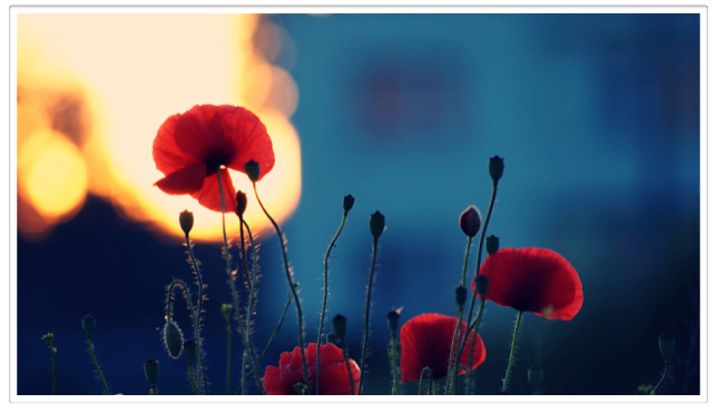
Photo By: C_osett
Conversely, you may take a sweeping all-inclusive image of the entire field of poppies. The potential problem here is that sometimes when we try to fill the entire frame with objects, lines, people, shapes, etc, we actually overcomplicate things and leave the viewer struggling to find a natural place to rest their eyes. But in both of these scenarios, we are focussing first on the subject and then subsequently looking for any opportunity to incorporate accentuating space in a balanced and harmonious way.
The second broad approach is to actually first seek out elements or scenes that would lend themselves to creating evocative accentuating space and then within those scenes either looking for existing detail to serve as the primary focal subject or alternatively wait for a subject to enter the scene to serve as the key focal element.
For example, you may come across the side of a building that possesses a number of windows that form a pleasing pattern. Behind these windows may be an escalator. In this instance, having spotted our accentuating space (i.e. the windows creating a pleasing pattern), we then wait for someone riding the escalator to enter the scene behind one of the windows and boom, we now have our focal subject surrounded by accentuating space.
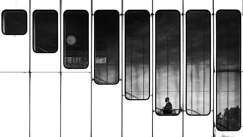
Photo By: Dragan
So now that we’re mindful of these two broad approaches, let’s now explore some “levers” we can use to harness the power of accentuating space with greater intent.
Edge Framing
One of the easiest ways to incorporate accentuating space in your images is to simply position your subject close to an edge or corner of your frame. Doing so will instantly give your primary subject more emphasis – so long as your accentuating space does not overwhelm the primary subject.

Photo By: Joiseyshowaa
High Contrast – Dodging
In the traditional sense of negative space, one would commonly create “emptiness” in a frame by looking for high contrast scenes where the wide dynamic range either causes shadows to expose as deep blacks or highlights to burn out. Doing either of these will eliminate detail in the respective areas and as such will create emptiness.
When an image is exposed or post-processed to burn out the highlights, this is known as dodging.
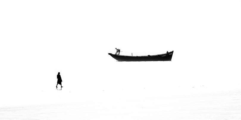
Photo By: Jayanta Roy
High Contrast – Burning
The opposite of dodging is burning, where shadows are under-exposed to create deep blacks areas within the frame. The key to burning is being able to pre-visualize shadows that you can see detail in with the naked eye as exposing pitch black in the final image.
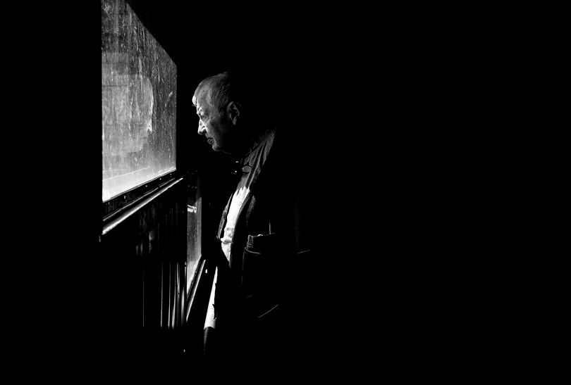
Photo By: Reiner Girsch
Contrasting Tones
Whether shooting in color or monochrome, seeking out and incorporating areas with contrasting tones can add interest and drama to your image.
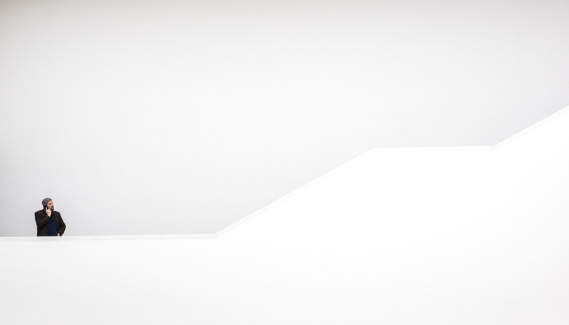
Photo By: Georgie Pauwels
Contrasting Colors
Another simple yet powerful way to add emphasis to your primary subject is to bathe it in an expanse of contrasting color.

Photo By: Daniel Sjöström
Contrasting Textures
As we touched on earlier, the purpose of accentuating space is to enrich our primary subject without causing a distraction. Incorporating a textured surface in your accentuating space is a great way to enrich your images.
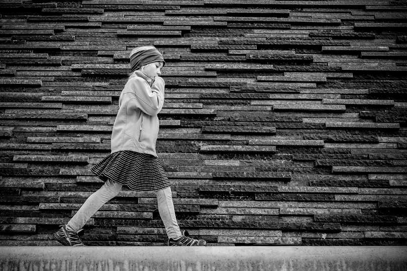
Photo By: Reiner Girsch
Juxtaposed Context
As we’ve discussed, the role of accentuating space is more than simply draw attention to the primary subject. It also serves to create mood, evoke emotion and convey the story. If ever you come across a scene where your primary subject is in an unusual or contradictory environment, finding a way to incorporate that environment as abstract accentuating space can enrich your image’s message.
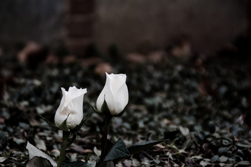
Photo By: Matt Swern
Step Back
Often times we get so fixated on our subject that we overlook the wonderful opportunities that surround them. By physically and metaphorically stepping back we can often discover scenes where less (subject) becomes more (emotion).
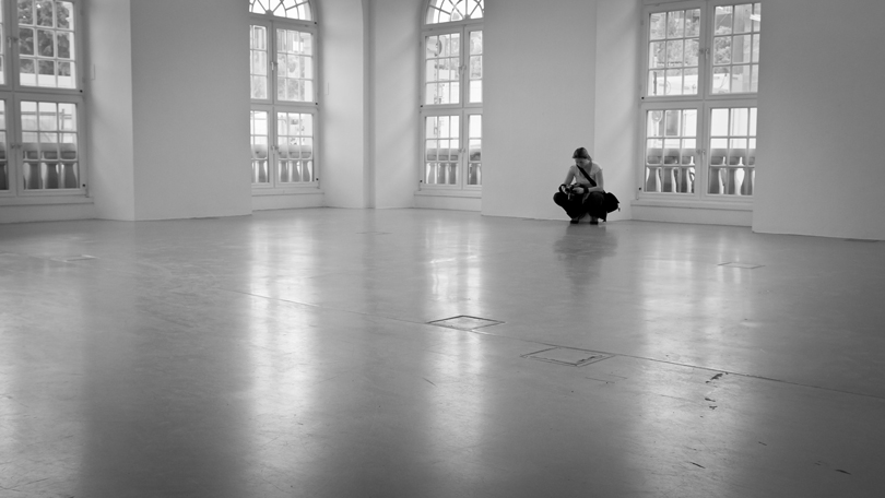
Photo By: Frank Lindecke
Large Aperture
A simple and effective way to create accentuating space is by using a small aperture to give you a shallow depth of field. By literally focusing on your subject, the background will blur out of focus to become an abstract palette of color.
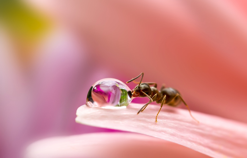
Photo By: Miki Asai
Long Exposure
Using a long exposure in an environment where there is movement (e.g. street scene or shoreline) will remove details and texture and transform these dynamic elements into abstract accentuating space.

Photo By: Paul Symes
Panning Blur
Similarly, panning your camera on a moving object will cause the background to blur, again creating an opportunity to harness the power of accentuating space. A tip here, when composing your primary subject in such a frame, it’s generally a good idea to position your moving subject so that they are “moving into” the accentuating space.
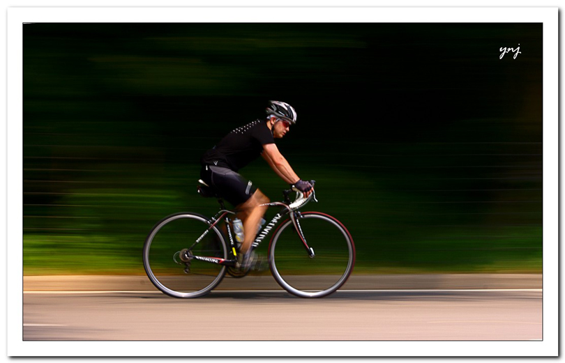
Photo By: Yogendra Joshi
Fog / Mist
Another great way to “turn down” distracting background elements is to photograph subjects in fog or when there is mist just behind your subject. The emotional charge of such accentuating space can be dramatically amplified if either your subject or the mist is “spot-lit” by direct light.
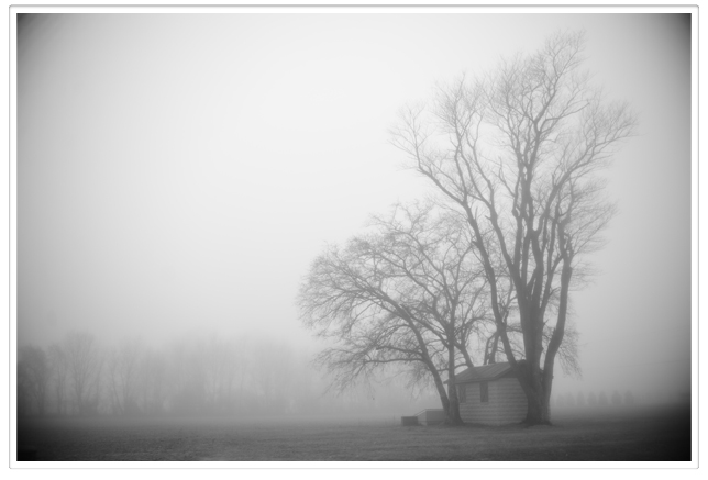
Photo By: John Donges

Photo By: CK NG
Smoke / Steam
In a similar manner to fog, any atmospheric condition that can catch light and veil background detail (e.g. smoke, steam, smog) can present you with tremendous potential to capture beautiful accentuating space.

Photo By: Lucian Constantin
Partial Veil
Speaking of veiling the background, physical veils such as curtains or any other semi-transparent material can serve as accentuating space, especially if it is back-lit and part of your subject is peaking through the material.
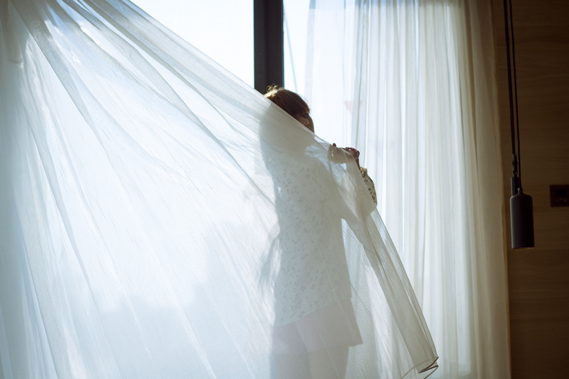
Photo By: Ame 0399
Shoot Up
The sky is perhaps the easiest accentuating space to photograph. If you are shooting an object in the sky (e.g. plane, bird, balloon) look for any tall structures (e.g. buildings or trees) that you could incorporate in your accentuating space as abstract shapes to further embellish your subject.
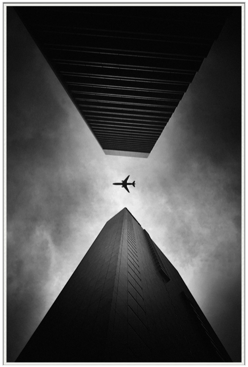
Photo By: Shady S
Shoot Down
Conversely, finding a high vantage point and shooting downwards will present you an expanse of ground. Not only does this provide you with ample accentuating space, the unusual perspective often heightens the impact of your subject.
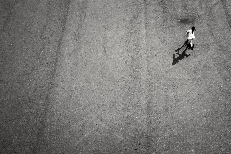
Photo By: Boris Thaser
Repeating Patterns
If you come across any scene where there is a repeating pattern, find a good vantage point and just wait, ready to shoot of course. Then, when a someone enters that scene, you’ll have the makings of an image possessing stunning accentuating space.

Photo By: Bob Holmes
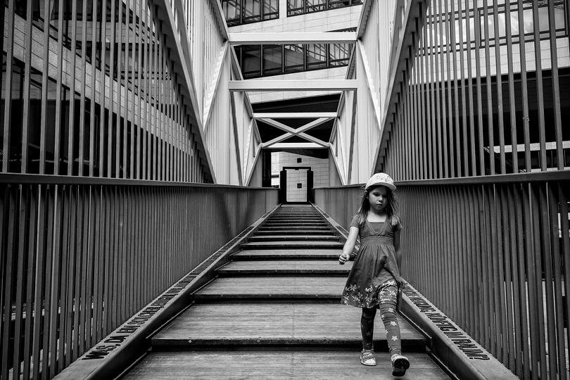
Photo By: Reiner Girsch
Frames
An oldie but a goodie. Not only are physical frames are often associated with walls (which can offer you a “wider” accentuating space), they are also often accompanied by varying light intensities. When combined, these two elements can dramatically infuse your subject with tightened focus and drama.
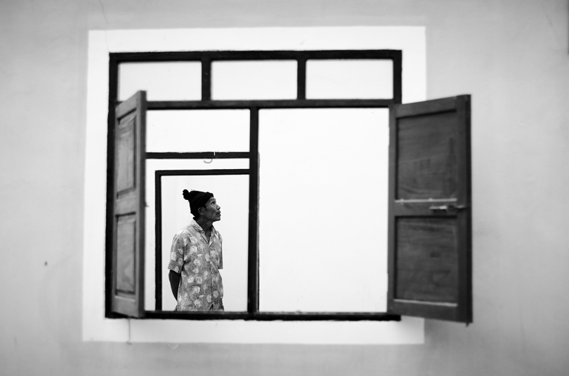
Photo By: Björn Bechstein
Silhouettes
Another simple yet visually appealing way to create accentuating space is to simply shoot silhouettes. By back-lighting your subject you eliminate detail and texture from your subject’s surrounds. So long as the outline of your subject is readily recognizable, creating beautiful accentuating space is relatively easy.
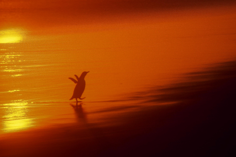
Photo By: Angelo Ioanides
Optical Effects
Taking silhouettes one step further, if you can capture an optical phenomenon in the background that forms a pleasing abstract pattern, you can elevate the emotional power of your accentuating space dramatically.
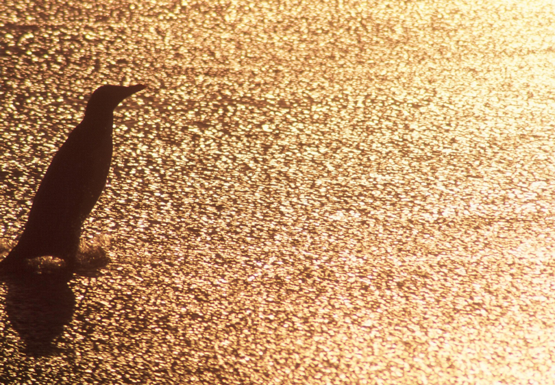
Photo By: Angelo Ioanides
As you can see, accentuating space can be created with a huge array of objects and even light. What’s more, you can use these accentuating elements on their own or in combination. For example, in the image below our accentuating space incorporates both texture (the breaking water) and contrasting color.
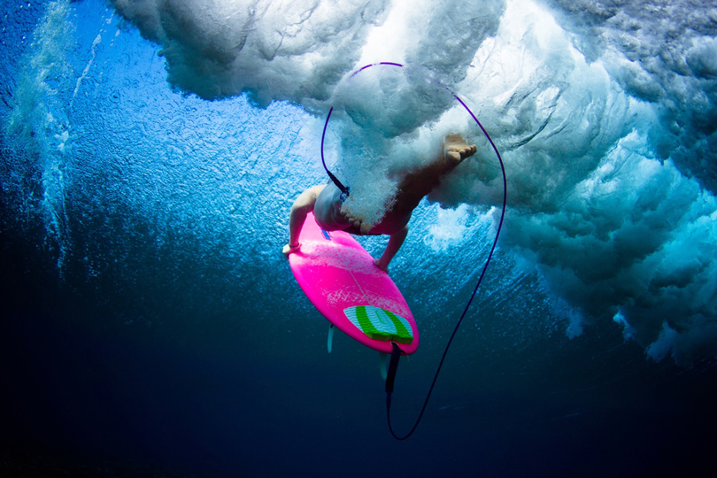
Photo By: Sarah Lee
So I hope this has not only helped clarify any confusion over negative space but more importantly opened your eyes to the infinite opportunities to incorporate accentuating space and infuse your photography with story and mood every time you pick up your camera.
In closing, I encourage you to have fun with accentuating space. Play around with how big or small you frame your subject. Experiment with different positions within the frame. Be on the constant lookout for opportunities to harness the tools we have just talked about.
Remember, accentuating space is an immensely powerful element of every photograph, or at least it has the potential to be such. Learning to use it with intent will certainly help you find not only new ways of composing your photographs but also new ways to learn and convey the story of your subjects.
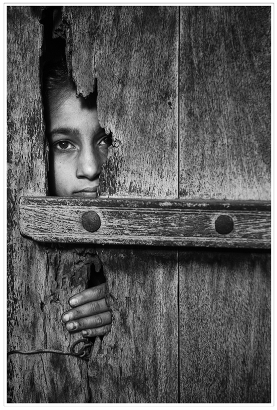
Photo By: Ali Al-Zaida
Angelo Ioanides
October 2017
Angelo Ioanides is the founder and publishing editor of Extraordinary Vision Magazine. Driven by his conviction that an image's ultimate source of power is derived from your creative vision, Angelo first published EV Mag in 2012 to serve as the outdoor photographer's source of insight and inspiration. Since then it has become the #1 outdoor photography magazine in iTunes. Discover the beauty and inspiration of EV Mag for yourself. Click here to get 13 Issues (includes the current issue as well as the next two issues) absolutely free.
You May Also Enjoy...
Celebrating Alternative Photography: Cyanotype Prints with Ashok Viswanathan
FacebookTweet By: Ashok Viswanathan – FFIP, EFIAP.PPSA Cyanotype is one of the earliest printing processes, dating from 1842 by Sir John Herschel, shortlyafter the discovery
Celebrating Alternative Photography: Mastering the Van Dyke Process with Ashok Viswanathan
FacebookTweet Long-time Lula member, Ashok Viswanthan, kindly offered to share his approach and methods for alternative photography processes. I hope you enjoy his detailed “how-to”
