:format(webp)/cdn.vox-cdn.com/uploads/chorus_image/image/73289170/240307_2024_Uniforms_Media_Day_946.0.jpg)
The new uniforms for the Detroit Lions leaked before lunch on Thursday, April 18, just hours before they were due to be unveiled to special guests and media at Ford Field. After spending some time looking over two-dimensional images of the uniforms for the past hour or so, it’s time to decide if these new threads for the Lions are either hot or not.
Lions home jersey
If OutKast’s hit single ‘So Fresh, So Clean’ was a jersey, it would be these new blues. Much like that song, the Lions are harkening back to the year 2000 and utilizing striping, clean lines, and the traditional Honolulu blue, silver, and white from the jerseys of old.
:format(webp):no_upscale()/cdn.vox-cdn.com/uploads/chorus_asset/file/25407892/240306_2024_Uniforms_Media_Day_77.jpg)
The color of the number font is white with silver trim, ditching the hard-to-read italicized numbers from the previous jerseys that were silver and trimmed in “anthracite,” a dark steel grey that wasn’t discernible from distance. Also, kudos for them sticking with the numbers on the top of the shoulders and cleaning up the sleeves. It keeps them less busy and gives room for those stripes to breathe and feel more like a feature and less like an add-on—it also helps that there isn’t a “LIONS” and “WCF” stencil blazing through them.
:format(webp):no_upscale()/cdn.vox-cdn.com/uploads/chorus_asset/file/25407901/240306_2024_Uniforms_Media_Day_49.jpg)
As far as upgrades go, there’s really nothing more to ask for from these new home jerseys. It’s clean, sharp, and the names and numbers being in white provides a better contrast than the blue and silver did before. The numbers are what many fans griped about over the years with the previous uniforms, especially if you made your way out to Allen Park to catch some training camp action and not even a media guide could help you tell one player from another when in the bleachers.
Verdict: So hot—like bring-a-eulogy-to-a-screeching-halt kind of hot.
Lions away jersey
Just as they did with the home jerseys, the organization looked to the past to set the table for the Lions new away jerseys—and by “the past” I mean the jerseys they had last year. Gone are the italicized numbers, but the numbers stayed blue, the trim stayed silver, and not much has changed... except for one small addition.
:format(webp):no_upscale()/cdn.vox-cdn.com/uploads/chorus_asset/file/25407880/240306_2024_Uniforms_Media_Day_928.jpg)
The serif wordmark logo “DETROIT” sits front and center just above the numbers and below the NFL shield at the bottom of the collar and it’s... fine. It does seem a little odd that the home jerseys don’t feature a “LIONS” for consistency’s sake, but it just feels like someone thought: “Doesn’t this look like too simple of a redesign? Let’s slap a wordmark there to give it something.”
:format(webp):no_upscale()/cdn.vox-cdn.com/uploads/chorus_asset/file/25407905/240306_2024_Uniforms_Media_Day_523.jpg)
But again, the design team deserves to be commended for not reinventing the wheel with these home and away jerseys. It wasn’t complicated to highlight the parts of the team’s brand and embrace simplicity, and if not for overthinking the wordmark, this would have been a clean sweep of success.
Verdict: Hot, but not as hot because you forgot that rule about checking the mirror and taking off one accessory before walking out the door.
Lions alternate jersey
If you were out there campaigning on social media for the Lions to embrace the color that wasn’t part of their visual system for the better part of 50 years until Matt Millen arrived and ushered in one of the worst eras in North American professional sports and make it their alternate uniforms: congratulations—you won. You get to join an elite fraternity of the other third of the league that has black uniforms.
:format(webp):no_upscale()/cdn.vox-cdn.com/uploads/chorus_asset/file/25407891/240306_2024_Uniforms_Media_Day_665.jpg)
So while we’re dinging it points for being a random departure from their brand and for its unoriginality, let’s also acknowledge that yes, this was probably one of the better outcomes for the alternate helmet the team debuted last year but didn’t work well with the steel gray “pajama” uniforms. They did update the helmet, removing the retro logo from the 1960s in favor of the current logo. They modernized the whole look, so they get points for not having it clash stylistically, but then why have that “LIONS” wordmark across the chest of these uniforms?
:format(webp):no_upscale()/cdn.vox-cdn.com/uploads/chorus_asset/file/25407909/240306_2024_Uniforms_Media_Day_1021.jpg)
Oh yeah, that’s right, you need it there because you could’ve mistaken it for North Carolina’s alternates.
:format(webp):no_upscale()/cdn.vox-cdn.com/uploads/chorus_asset/file/8834167/186009316.jpg)
Verdict: “We once had things in common
Now the only thing we share is the refrigerator
Ice cold, baby, I told you, I’m ice cold”
Overall Thoughts
There’s way more good than bad here, and to borrow a phrase from Brad Holmes’ favorite baseball idioms, they knocked it out of the park with the home and away jerseys. They fixed the readability of the numbers with the old jerseys, stripped away (most) of the clutter, and did a great job not trying to shoehorn too much modern into what’s ultimately a rewind refresh.
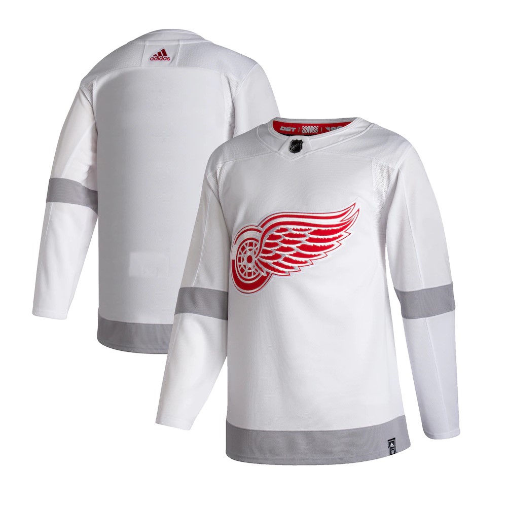
And since they did so well with those, the alternate uniforms get a pass. They’ll work fine for those updated alternate helmets, it’ll be fine. Still, it would’ve been cool for them to look at what the Red Wings did with their Reverse Retro jerseys with the silver on white. I’ll admit that I wasn’t crazy about them when they were released, but that white on silver with some blue accents could have been an icy look for a snowy game in January at Lambeau.
Loading comments...