Hidden vs. Disabled In UX

Email Newsletter
Weekly tips on front-end & UX.
Trusted by 200,000+ folks.
Both hiding and disabling features can be utterly confusing to users. And for both, we need very, very good reasons. Let’s take a closer look at what we need to consider when it comes to hiding and disabling — and possible alternatives that help enhance the UX.
This article is part of our ongoing series on design patterns. It’s also an upcoming part of the 10h-video library on Smart Interface Design Patterns 🍣 and the upcoming live UX training as well. Use code BIRDIE to save 15% off.
Show What’s Needed, Declutter The Rest
You’ve probably been there before: Should you hide or disable a feature? When we hide a feature, we risk hurting discoverability. When we disable it without any explanation, we risk that users get frustrated. So, what’s the best way to design for those instances when some options might be irrelevant or unavailable to users?

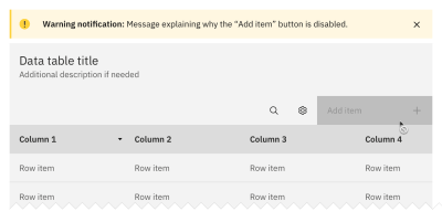
As a rule of thumb, disable if you want the user to know a feature exists but is unavailable. Hide if the value shown is currently irrelevant and can’t be used. But never hide buttons or key filters by default as users expect them to persist.
Unlike hidden features, disabled features can help users learn the UI, e.g., to understand the benefits of an upgrade. So, instead of removing unavailable options or buttons, consider disabling them and allowing the user to “Hide all unavailable options.” Be sure to explain why a feature is disabled and also how to re-enable it.
Another thing to watch out for: When we allow users to switch between showing and hiding a feature, we also need to ensure the switch doesn’t cause any layout shifts.
For both hiding and disabling, we need very thorough considerations of available alternatives, e.g., enabled buttons, read-only state, better empty states, hide/reveal accordions, error messages, and customization. We need to show what’s needed and de-clutter the rest.
Whenever possible, I try to keep buttons and features in their default state — enabled, accessible, and legible. When a user interacts with that feature, we can explain why they can’t use it, how to enable it, and how to keep it enabled. Possible exceptions are confirmation codes and loading/processing states.
Hiding vs. Disabling Roadmap
As Sam Salomon suggests, if you’re unsure whether hiding or disabling is the best option for your use case, ask yourself the following question: “Will a given user ever be able to interact with this element?” Depending on your answer, follow the steps below.
✅ Yes
→ Disable it (as disabled buttons or read-only state).
↳ For temporary restrictions or filter incompatibility.
↳ When a value or status is relevant but not editable.
↳ When an action isn’t available yet (e.g., “Export in progress…”).
🚫 No
→ Hide it (remove from a toolbar, collapse in accordion).
↳ E.g., due to permissions, access controls, safety, and security.
↳ For inaccessible features: e.g., admin buttons, overrides.
↳ Hide such controls by default and reveal them once a condition is met.
Key Takeaways
- Hiding important features hurts their discoverability.
- Disabling features is frustrating without an explanation.
- But some options might be irrelevant/unavailable to users.
- Users might expect a feature to exist but won’t find it.
- We need to show what’s needed and de-clutter the rest.
- Avoid disruptive layout shifts as you show and hide features.
- Don’t remove unavailable options or buttons automatically.
- Instead, disable them and allow it to “Hide all unavailable options.”
- Allow users to hide sections with a lot of disabled functionality.
- Explain why a feature is disabled and how to re-enable it.
Hidden vs. Disabled In Design Systems
The design systems below provide useful real-world examples of how products design their hidden and disabled states.
Useful Resources
- Disabled Buttons And What To Do Instead, by Adam Silver
- Hidden vs. Disabled States, by Maria Panagiotidi
- Making Disabled Buttons Inclusive, by Sandrina Pereira
- Hide or Disable, by Sam Solomon
- The Disabled State In UI Design (Sketchnotes), by Krisztina Szerovay
- Usability Pitfalls of Disabled Buttons, by yours truly Vitaly Friedman
- Alternative Design Patterns For Disabled Features, by Katie Jacquez
- Designing Filters UX That Works, by yours truly Vitaly Friedman
- UI Traps: Disabled Buttons and Inputs, by James Carleton
Meet Smart Interface Design Patterns
If you are interested in similar insights around UX, take a look at Smart Interface Design Patterns, our 10h-video course with 100s of practical examples from real-life projects — with a live UX training later this year. Everything from mega-dropdowns to complex enterprise tables — with 5 new segments added every year. Jump to a free preview.

100 design patterns & real-life
examples.
10h-video course + live UX training. Free preview.
 (yk)
(yk)