Design Smarter, Not Harder: Competitor Analysis Secrets for Product Designers

Competitor analysis in UX design is essential for understanding where a product stands in the market. It’s a way to find out competitors’ strengths, weaknesses, and strategies, providing valuable insights that help in the design process. In this article, I present a framework for conducting effective competitor analysis, which utilizes a template as a foundation to assist UX designers in creating better experiences.
Why Competitor Analysis is Crucial in UX Design
These days just designing a great product is not sufficient. Competitors knowledge allows a good ux designer to meet the gaps in the market, adopt industry best practices, and design a user-centered product. Here’s why competitor analysis is essential:
- Identify Trends & Design: Competitors are a great way to keep track of UX trends and design in the industry.
- Spot Opportunities: Find areas of competitor products with room for improvement.
- Informed Decision-Making: Competitor insights enable data-driven design decisions, reducing guesswork in product development.

Setting Up Your Competitor Analysis Framework
Start by identifying your key competitors and gathering information about their products. Depending on your product, you can include direct competitors (similar product with a similar audience) and indirect competitors (almost similar product but for a different audience).
Download Template: https://docs.google.com/spreadsheets/d/14mU37iB2oGe6ngLMGQKQfue89RDL1hMz5BCoaKYuBw0/edit?usp=sharing
S.W.C.D.UX.O Analysis
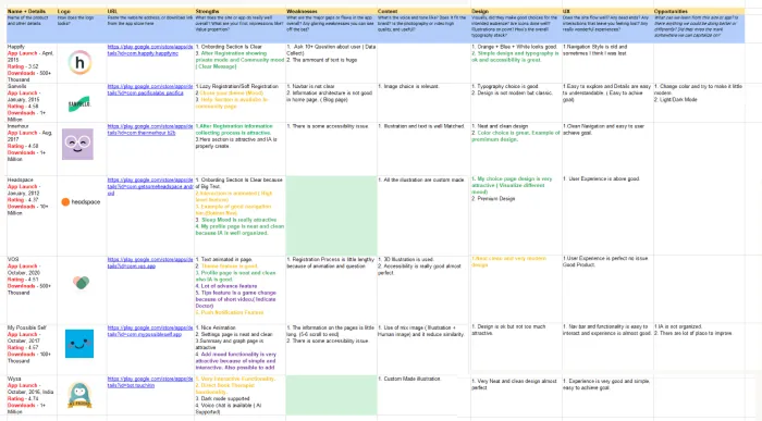
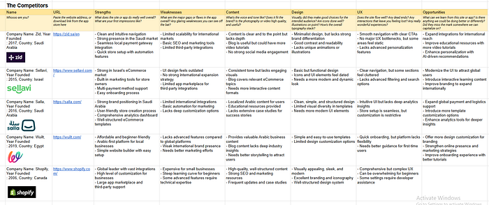
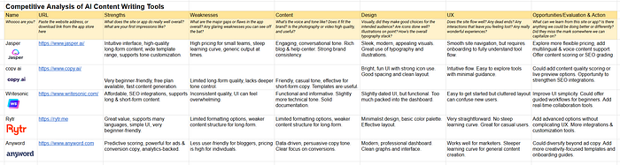
The template includes various columns to help you break down different aspects of each competitor’s UX. Let’s look at each one in detail, using an example to illustrate.
Strengths
In this section or columns, you’re identifying what the competitor does well:
When analyzing strengths, consider:
- Ease of Navigation: How intuitive is the layout?
- Feature Highlighting: Does the product offer unique features or innovative elements not seen elsewhere?
- First Impressions: What are your initial thoughts upon using the site or app?
- Overall Strengths: What does the site or app do really well?

Example Data: For Yelp, strengths include multiple service categories, an accessible map, and intuitive search functionality. The clear structure and visibility of key actions, like “Redo Search In This Area,” allow users to perform actions quickly without extra steps.
Weaknesses
Here, you’ll list any gaps or pain points in the competitor’s offering:
To identify weaknesses, ask:
- Pain Points: Where do users encounter friction?
- Efficiency: Are there redundant actions or excessive content?
- Major Gaps or Flaws: What significant issues or shortcomings does the app have overall?
- Any Glaring Weaknesses You Can See Off the Bat: Are there any noticeable problems right away?
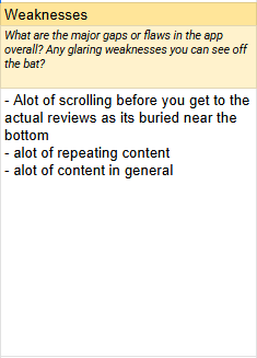
Example Data: Yelp’s app requires a lot of scrolling to access key information like reviews. This can be a pain point, especially if users are looking for quick feedback. Repetitive content and an overloaded interface can overwhelm users.
Content
The quality and tone of the content is, what you should find here:
So, when evaluating content, think about:
- Consistency: Is the style of content consistent throughout the platform?
- Brand Tone: Is it consistent with the brand’s voice and audience?
- Utility: Is the content readable and visually stimulating?
- Image & Video: Is the photography or video high quality and useful?
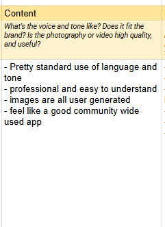
Example Data: Yelp’s content uses a standard language and tone, making it professional and easy to understand. All images are user-generated, which gives it a community-wide appeal.
Design
This section focuses on visual elements and overall design:
For design analysis, look at:
- Visual Hierarchy: Are key elements easy to spot?
- Design type: Is it aesthetic and fits with the brand?
- Accessibility: What icons, contrast, or typographic choices make it more usable?
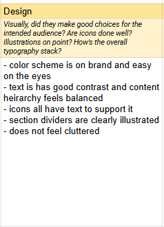
Example Data: Yelp’s design uses a color scheme that aligns with its brand, creating a cohesive look. Accessibility is also noted, with elements such as icons doing a good job of explaining themselves with accompanying text, and the layout feels balanced without being cluttered.
User Experience (UX)
Assess how the competitor’s app or site flows and meets user expectations:
Consider these aspects in UX:
- Intuitiveness: Are users able to navigate the site or app effortlessly?
- Engagement: Are there any interactions that feel particularly satisfying or frustrating?
- Accessibility: Is it all easy to find with minimal searching?
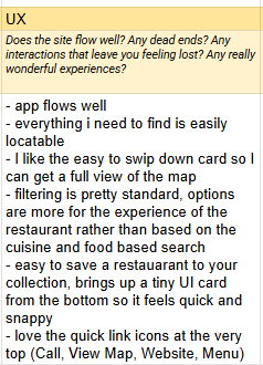
Example: Yelp’s app flow is intuitive and natural. Swipe-down cards make usability friendly, and icons at the top (Call, View Map, Website, Menu) provide at-a-glance access to key actions.
Opportunities/Evaluation and Action
This section identifies areas for improvement or innovation by analyzing gaps in the competitor’s offering.
When looking for opportunities, ask questions such as:
- Learn from Competitors: What can we learn from this site or app?
- Identify Improvements: Are there unused features or cluttered areas that could be simplified?
- Capitalize on Weaknesses: Did they miss the mark somewhere we can capitalize on?
- Differentiate Your Offering: What can you include that others don’t to stand out?
- Enhance Accessibility: Are there design adjustments that could make the product more inclusive and user-friendly?
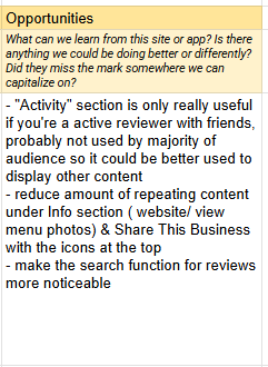
Example Data: Yelp’s “Activity” section could be redesigned to display more relevant content for casual users. Reducing repetitive content under the “Info” section could also enhance readability. Additionally, Yelp’s review search functionality could be made more visible to improve the user experience.
Example
Below are screenshots from various projects I’ve worked on. These examples are given in order that you may better understand how to research in a similar way effectively.
Putting It All Together: Deriving Actionable Insights
Once you’ve finished the competitor analysis for every product, it's time to extract insights that will help shape your UX design strategy:
- Strengthen Unique Value: Use insights from the template to refine your own product’s value proposition.
- Enhance User Journey: Address common pain points in your design based on competitor gaps.
- Emphasize Accessibility and Usability: Focus on providing a more accessible, streamlined experience than your competitors.
Conclusion
Competitor analysis in UX design is invaluable for spotting trends, understanding user needs, and building better products. By following this structured template, you can gain a comprehensive understanding of your competition and identify opportunities to elevate your own design. Start with the basics, evaluate each category carefully, and use the insights to build a product that stands out in the market.
Feel free to reach out if you have any questions, and if you found this article handy 👍, then connect with me on LinkedIn (I would love to hear from you).

