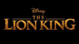
"Everything you see," says Mufasa in the new Disney Lion King trailer, "exists together in a delicate balance." Yeah? Well try telling that to whoever designed the logo for the film, which has left a reddit user itching to make corrections thanks to its apparently unbalanced lettering.
So what's the problem with the logo design? According to reddit user wintergreebliss, the letter G isn't in the right place, throwing the whole composition off. Posting in the r/Design channel, she commented "[h]aving the G sit right on the baseline was making my eye twitch, so I fixed it 😂".
Check out her tweaked version below, which nudges the G down ever so slightly to make the logo more pleasing to the eye.
Do you agree that this subtle change evens out the design? Or does the alteration throw the composition off even more? Commenters on the channel seem to support with wintergreenbliss' update, with reddit user thedoomfruit chipping in to say "Disney really f*****G up on that one." See what they did there?
Typographic niggles aside, The Lion King does look set to be a feast for the eyes. Check out the trailer below and get ready to be blown away by some jaw-dropping 3D visuals.
Related articles:


