Adobe, please finally make Type decent in Lightroom
A couple of weeks ago I did a tutorial (link) on how to create a 6-up layout in the print module (six tall images on one page). In that tutorial I showed how to use the Identify Plate so you can add text below your image. Even as I was writing the tutorial, I couldn’t help but think, “This is just a mess.”
It was Adobe that first brought professional type to computing — it’s in their DNA — heck a ton of our fonts have Adobe in the title, but when it came to Lightroom, it’s like Adobe got amnesia. Lightroom has the most limited type features of any program you have today on your computer. Any of them. Even Apple’s free TextEdit app runs rings about Lightroom’s type features…with one exception and that’s what this post is about.
Take a look at the Type panel from Lightroom Classic’s Book module (below):
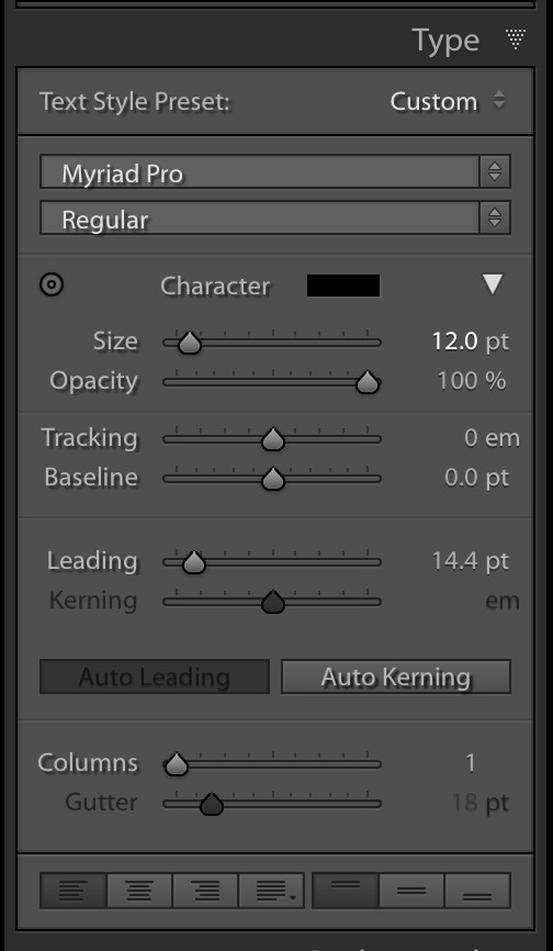
Tracking, Leading, Kerning, Baseline Shift…actual real type controls and even text style presets. Real type controls, and this is already in Lightroom Classic inside the Book module.
Dear Adobe: Please copy this panel over to the Print Module and the Slideshow module.
You’ve already created it. It’s got a UI. It’s already a panel inside of Lightroom. It’s already there, just one module over. Move it over and then type in Lightroom is at least decent.
I know this might not be on the top of your Lightroom wish list, but this is already there. It’s not like we’re asking for a new feature — just take one that’s already there and copy it to where it will do more good. It’s low-hanging fruit for the Lightroom team. Just pick it!
Thanks for listening. 🙂
-Scott