Windows 10 icons are getting an overdue redesign
They should be at once more consistent and more distinctive.
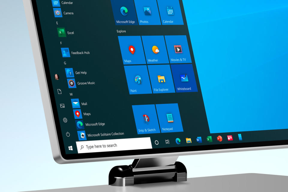

Microsoft refreshed Office's icons last year, and now it's Windows 10's turn. The software giant is rolling out updates to the icons for Windows 10's core apps over the months ahead, starting with the Calendar and Mail apps in a new Release Preview for Windows Insiders in the Fast ring. The company's design team explained that it wanted to break away from the flat, colorless icons you see today in favor of ones that are at once more consistent with newer branding (including apps available beyond Windows) and different enough that you'll have an easier time finding the one you want.
This is arguably an overdue move. Microsoft hadn't really touched Windows 10's main icons since its debut in 2015, so they risked feeling old. There were also inconsistencies creeping in, especially once Office got its new look. This update drags Windows 10's appearance into the modern era, and might just give you a more colorful OS in the bargain.
