


There is no question the internet is one of the greatest innovations of modern times. The web in particular has given billions of people a level of access to information, entertainment, goods and services, and human connection that previous generations could hardly imagine.
But not everyone can make use of the web equally. People with visual or physical impairments depend on technological aids to do on the web what the rest of us take for granted. And those aids succeed only insofar as web developers use or support them. Tricky page layouts can confuse screen readers, and even the unimpaired can have trouble making sense of low-contrast text or misleading colors.
The standards for accessibility on the web are generally driven by the W3C’s Web Content Accessibility Guidelines, or WCAG for short. Following all of the WCAG’s guidelines is a lot of work, though, and it’s easy to drown in a sea of minor details while missing the bigger picture.
In this article, we’ll run down 10 steps you can take, in ascending order of complexity, to make your websites more accessible. You can implement the simplest suggestions first, then work your way up as time and resources allow.
Incidentally, web accessibility measures not only help accommodate those with vision or motor control issues, but also make websites easier for everyone to read and navigate. These are improvements you can make to your websites that will benefit every visitor.
Caption your website’s images (easy)
One easy task you can do right away that yields big benefits is captioning the images on your website. Captions allow screen-reader software to read out descriptions of images encountered in the text. They also provide textual placeholders for images that can be helpful to website visitors with limited bandwidth or erratic connections.
The easiest way to caption images is to add an alt tag to the img tag, one that provides a textual description of what’s shown in the image.
<img src=”https://yoursite.com/deckard.jpg” alt=”Short-haired man in overcoat”>
If you provide captions with images as part of the text, and not just in the image’s metadata, use the figure and figcaption block-level elements. These elements can be styled individually or modified with CSS classes. Also, since figcaption is a block-level element, it can contain other elements or formatting as needed.
Another tag that can be added to elements to provide a description is the longdesc tag. Instead of containing the text that describes the image, it can contain a URI that provides the description. However, the state of browser support for longdesc is murky right now, so it’s best not to rely on it alone. Use longdesc in conjunction with alt or figure/figcaption.
Use header tags to organize documents (easy)
Using header tags is common practice in web design, but it bears repeating in this context: Use h1, h2, h3, etc. to divide documents into outline-level sections. The most straightforward approach is to mark the page’s title as h1 and mark any (and all) subheadings as h2.
Here’s why this matters for accessibility. Many screen readers interpret the header tags as anchors that the reader can skip to directly with a keystroke or command. This makes the document more navigable without having to add extra metadata.
Label forms and keep them readable (easy)
If you have descriptive text for the fields in a form, that’s good. It’s even better when those descriptions are explicitly associated with the elements they’re describing. Always use the label tag to associate each field description with its field, as this gives screen readers and other accessibility systems more context about each field.
Another potential accessibility issue in forms is the use of placeholder text in form fields. Placeholder text—the text suggestions that appear by default when nothing is typed in a field—is often useful. But it shouldn’t be relied on to convey essential information, as it’s typically displayed in dimmed type that might be hard to read. The information in the placeholder text should also be made available through the title property of the field, where it can be displayed as a tooltip on a mouseover or extracted by reader software.
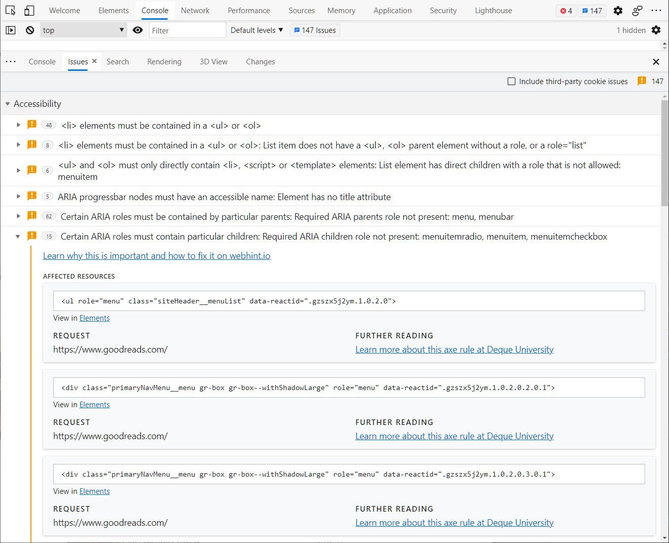
Note that you can often get quick feedback about form, image labeling, and other accessibility issues in modern browsers by using your browser’s inspection panel. In current builds of Chrome and Edge, for instance, the “Issues” tab in the developer tools window lists suggestions for enhancing accessibility.
 IDG
IDG
The “Issues” tab in the DevTools window of a recent build of Microsoft Edge. Accessibility issues are listed under their own header and can be browsed to examine the elements they refer to.
Ensure keyboard navigation of elements is consistent and accessible (moderate)
Most navigation on a web page is done with a mouse, or with touch events. Any element you’d want to have someone click on should be accessible with keyboard navigation. Just make sure that, in doing so, you don’t end up breaking other things.
When a page is in focus, the Tab key can be used to move between elements of the page in sequence—a property called “tab-indexable.” Clickable elements are tab-indexable by default, and are tab-indexed in the order in which they’re laid out in the document.
To that end, you want to let the order of elements in the document dictate the tab order as much as possible. It is possible to use the tabindex element to reorder how elements are tabbed through, but the modern web design strategy is to avoid reordering as much as possible.
You may also need to add tab indexes to custom-created JavaScript components. If you do, make sure you don’t inadvertently hijack the tab index from other components. (That linked document also has good advice on how to deal with subelements of controls, which should not be tab-indexed.)
Another way to make elements key-accessible is through keyboard bindings, where one can press a key to activate or move to a specific element. For instance, a chat application could send messages by using Alt-S when the text box is in focus, or jump back to the text box with another hotkey (to keep from having to scroll back to it).
If you want to add key bindings for page elements, keep these points in mind:
- Make it clear to the user what the hotkeys are and where they work. The user shouldn’t have to discover hotkey actions themselves, or blunder across them by mistake. Also, the scope of the action is important. If the hotkey is active only when some particular element is in focus, the user should know.
- The HTML-native
accesskeyattribute allows key bindings to be assigned to particular elements. However, its behavior is not consistently supported, and some key bindings might not be available to all users. Therefore it’s not recommended as a way to do this.
Allow manual font size adjustments, not just zooming (moderate)
One problem with letting the user zoom to adjust element sizes is that it changes the size of everything on the page. A better solution is to implement plus and minus icons somewhere on the page that change the size of the base text on demand, and to save that setting on the client. This would involve little more than a JavaScript function that alters the size of the base font for the text styles in the document.
Don’t use tables for layout (moderate)
This doesn’t mean you should not use tables, period. Tables are immensely useful when you need to present data in a rigid row-column format. They just shouldn’t be used for layout—that is, to format text that isn’t tabular data. Once upon a time, it was common practice to use tables to position elements. But today, flexbox and other block-level styling methods provide more sophisticated and powerful ways to position items accurately and responsively.
A key reason to not use tables for layout is that it’s a confusion of intent. Screen readers parse the contents of tables as data rather than layout. They interpret column and row headers on tables as labels for the data they contain. If a table is used for layout, the screen reader may misinterpret this.
If you’re already avoiding tables for layout and using a modern CSS framework, great! If not, take the time to switch to one and ditch the use of tables. That’s a potentially time-consuming effort, which is why we’ve listed this as a “moderate”-level item.
Create a dark or high contrast mode for your website (moderate)
Dark modes for websites and apps have come into vogue, and for good reason. With screens as big and bright as they are today, and with more of us staring into them for hours on end, a dark mode makes digital life easier on the eyes.
Many prepackaged themes for websites come with a dark mode style sheet of some kind. If you already use one, you could easily place a selector somewhere—say, in your site’s hamburger menu—that lets the reader toggle dark mode on or off, and persist the state in the browser. However, a website with a custom theme may be more difficult to skin up with a dark mode, since you will have to build a dark mode from scratch and make sure that all of the elements of your site are readable with it.
If you’re looking at a redesign, then lean towards themes that can be easily skinned for dark modes.
Use colors and designs to emphasize page elements (moderate)
One of the easiest ways to draw attention to an element on a web page, or to give it some emphasis, is to change its color. Not a bad idea by itself, but also not nearly enough. Color alone doesn’t always stand out, especially for people with visual impairments.
Emphasis should always be provided in more than one way—by combining color with other design patterns. For instance, a warning element could be displayed in red, set in a box, and given a warning icon. Bar charts should use textures as well as colors, whenever possible, to stand apart.
Of course, implementing this kind of change will likely require more than a mere style sheet. It might require a major redesign effort, depending on how your website is rendered.
It may also be worth testing your site’s color scheming with a color-blindness simulator to determine if people with certain visual impairments will have trouble navigating your site or making sense of its visual elements.
Use descriptive URLs whenever possible (moderate)
Descriptive URLs encode information about their destination. An opaque URL like https://magazino.com/article/2125451 doesn’t tell us anything about the article in question. We’d have to click through to find out, or at the very least read the page’s metadata (which might not be avaialble). By contrast, a descriptive URL like https://magazino.com/article/ten-best-harrison-ford-films/2125451 tells us a fair amount at a glance.
A descriptive URL reduces the amount of work a visitor has to perform to know what the article contains. That’s why a smartly designed website will devote some part of the URL to a short textual description of the contents, while the article ID is used by the server to determine what article to serve up.
Websites that don’t make use of descriptive URLs face a challenge. It’s no small feat to change to an entirely new URL scheme after years of accumulating legacy content. But it’s worth making descriptive URLs part of any redesign effort.
Use the WAVE tool to test website accessibility (advanced)
The WAVE tool, developed and maintained by Utah State University’s Center for Persons with Disabilities, provides detailed and graphical feedback about the accessibliity of a given website. Feed WAVE a URL, or use its API, and it will provide you with a report that breaks down all of the accessibility issues of the analyzed page. The analyzed page is also re-displayed with markup indicating where the problems lie, so you can get quick-click access to each issue and see its origins in the page’s source.
Any website created without accessibility in mind will almost certainly raise many issues with WAVE. Thus a WAVE analysis is best done in preparation for, or in conjunction with, a major overhaul of one’s website, and not as a spot corrective measure for this or that issue.
 IDG
IDG
The WAVE tool scans a web page and delivers detailed breakdowns of accessibility issues, major and minor.